
A white background that frames the image of the unmistakable Porta Pia- this is how Venturi’s Complexity and Contradiction in Architecture presented itself in 1966, a volume that, according to Vincent Scully, is the “most important of our time since Vers une Architecture” of Le Corbusier. This work would influence decades to come and its author was declared as the founders of the Postmodern movement, taking examples and references from Italy and Rome above all. They used this territory to create an architectural vocabulary, studying and drawing from it in order to breathe life into a new style. In light of this, the selection of the cover photo, Michelangelo’s Porta Pia, has a particularly intriguing significance.
The Postmodern movement is born in response to a crisis in the mid ‘70s and stems from the International Style and Modern Movement. A seemingly reactionary response, its foundation comes from ancient architectural inspirations. If Rome was the architectural gymnasium for this style, then the architects of this era began their training with the study of classical masterpieces, and the New York of the ‘70s and ‘80s was the “ring” in which their “matches” took place, coming head to head in search of fame and the symbol of a new architectural era. Victory would go to the most cunning and versatile architects of the 20th century: Philip Johnson, a figure who was able to reinvent himself throughout the multiple movements of the century, adapting to changing trends time and time again.
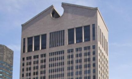
 The winning project was the AT&T building on Madison Avenue. Completed in 1984, it is still one of the most important symbols of the Manhattan skyline and, as Pulitzer Prize winner Paul Goldberger said, “it makes fun of the towers of glass and steel that have transformed New York into a city of boxes; this skyscraper is the most provocative and daring that has been built since the Chrysler building”. But what makes this building so special? Quite simply: we can say that it is a building that is completely timeless. With a strong Renaissance character, it has an imposing presence within its metropolitan surroundings. Instead of seeming forced and out of place, it fits within the urban fabric, somehow emphasizing its uniqueness.
Johnson’s building reintroduces a series of elements from the past. On one hand, it sites Louis Sullivan, the grand master of the Chicago school that, by the end of the 1800s, successfully anticipated the American style of the following century. On the other hand, it showcases an especially strong influence from classical architecture: from the red granite exterior to the arches of the grand entrance loggia (7 stories high), to the circular windows and finally the oversized tympanum that gives it its truly iconic identity. References to the past are explicit and it was the same designer who, spurred by the criticisms, admitted to his role models stating that “the architecture in New York had only two significant periods, at the end of the 1800s with McKim, Mead and White and in the ‘20s with Raymond Hood”. But what Johnson cleverly does not reveal is that, those role models were in turn inspired by ancient archetypes that the AT&T inherits. The outcome, with the massive structure and classic design, is like an ancient trace between more modern buildings. From the Palladio tympanum to the entrance loggia of Alberti, with many hints of roman architecture of course, all of the elements in this building seems to give homage to Italian monuments.
 By a strange twist of historical references and quotations, when Franco Pure designed the first “skyscraper" in Rome, the infamous Eurosky, the comparison Johnson’s AT&T building was inevitable. In his design, Purini was clearly quoting the pattern of openings in the facade while replacing the neoclassical pediment with awkward projecting canopies of photovoltaic panels, a sort of re-interpretation of a television antenna similar to the one that Robert Venturi uses in the Guild House in Philadelphia.
The effect that the AT&T building had in the media was surprising. Its unique silhouette, that emerged from the modern boxes that surrounded it, suggest to William J.R. Curtis the analogy between architecture and consumer good, noting that this skyscraper was more of a real marketing product rather than mere architecture. This building would be the first of a long lineage that we are still witnessing today. Ironically, only a few years after completion, the company that had commissioned it (and which had moved its headquarters to the building), implemented a massive downsizing plan due to the economic crisis that hit the country in 1987. An economic growth that seemed unstoppable was halted, forcing AT&T to sell the skyscraper to Sony, the Japanese multinational.
Since the project was announced in 1977, the AT&T building sparked immediate reactions and criticisms from the public. The result was an exhilarating anthology of comments. Many likened the striking “punctured” pediment to a piece of “Chippendale”-style furniture or even to a public telephone, complete with a slot to insert coins in. Others sarcastically compared the building to a “poor copy of the Seagram (from Mies) with the addition of an ear”. Regardless, this project guaranteed its author fame and even a cover on Time magazine in 1979, where Philip Johnson’s portrait is shown with his hand on a model of the building confirming his celebrity status and turning him into the first archistar.
One thing is certain: dismissing this building as a whimsical design bordering on kitsch means to ignore the history of that particular moment, suspended between the sunset of the modern utopia and the failure of the capitalist dream. Thanks to this building and its creator, it is clearly this stage of architectural history that, for better or for worse, led us to the contemporary world we are now living in.


