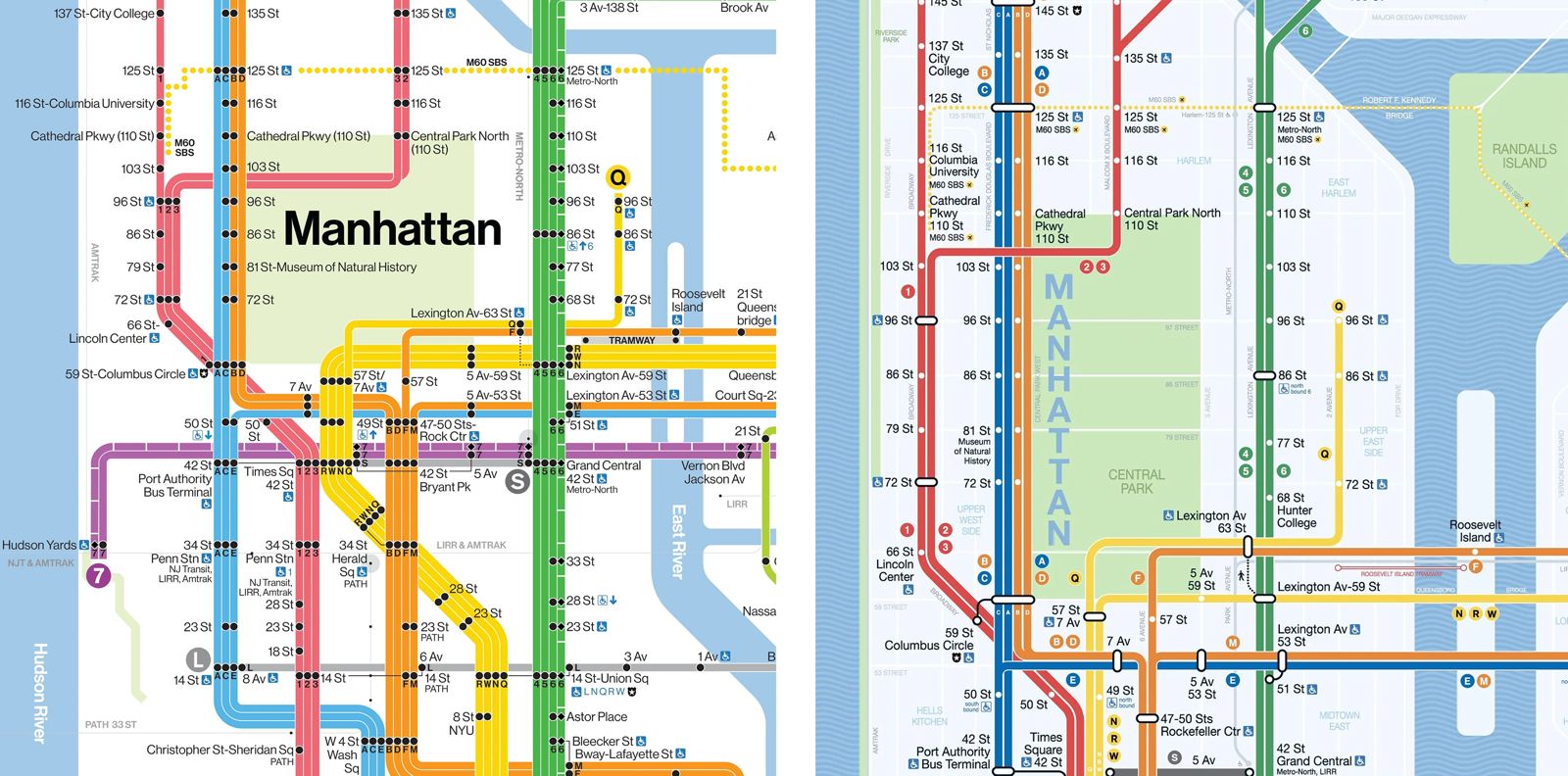
This spring, the MTA quietly started rolling out a brand-new subway map. It’s the first full redesign since 1979. And while it might look cleaner, more minimal, and — dare we say it — kind of chic, it also marks something bigger. Not just a new look, but a shift in how we think about getting around the city.
The lines are no longer trying to mirror every curve of New York’s tangled streets. They’re straight, clean, confident — crossing the city diagonally, horizontally, vertically. The station names are simple black text on white. The stops are dots. The routes are color-coded and easy to follow. It’s a map that wants to be read at a glance, not decoded with a magnifying glass. It’s also been designed with accessibility in mind: better contrast, better legibility, better for everyone.
In a way, it’s a love letter — or maybe an apology — to Massimo Vignelli, the Italian designer whose famously abstract 1972 subway map was laughed out of town. He imagined the subway system as a network of logic and lines, not geography. Riders hated it. They said it didn’t look like New York. In 1978, Vignelli went head-to-head with John Tauranac, who pushed for a map that showed the city as it really was. Tauranac won. The so-called spaghetti map was born–and stayed.

But New York changed. So did the riders. These days, most people pull out their phones before they ever glance at the printed map. They aren’t looking for streets, rivers, or cardinal directions — they want to know which train to take, where to switch, and how to get out.
That’s what the MTA’s in-house design team focused on. Their new version highlights the big hubs, makes transfers easier to see, and adds clarity to complex station layouts — whether the next train is across the platform or across the street. Even the legend got a refresh: there’s now a QR code that takes you straight to the MTA website, and extra info about accessibility, safety, and connections.
The map wasn’t born overnight. Back in 2021, a pilot version appeared online, created with the help of the design studio Work & Co. It had that Vignelli vibe — bold, clean, kind of beautiful. Since then, after feedback, testing, and more than a few surveys, it evolved into what’s now being printed and displayed.
The final product is a hybrid. The minimalism of Vignelli is still there, but so are the familiar colors and references from the Michael Hertz map that most New Yorkers grew up with. The rivers are blue. The parks are green. The city’s geography isn’t exact, but it’s still hinted at. Designer Michael Bierut said it best: it fixes what regular people found annoying in the 1972 version, but keeps the elegant geometry that made designers swoon. Installation is already underway, and it comes at a moment of other big shifts: MetroCards are being phased out. OMNY, the contactless tap system, is here. Station screens are getting smarter, updating every five seconds. Slowly but surely, the subway is stepping into the 21st century.


